The Astronauts Campaign Lands Luezers Archive Magazine Cover & Communication Arts.
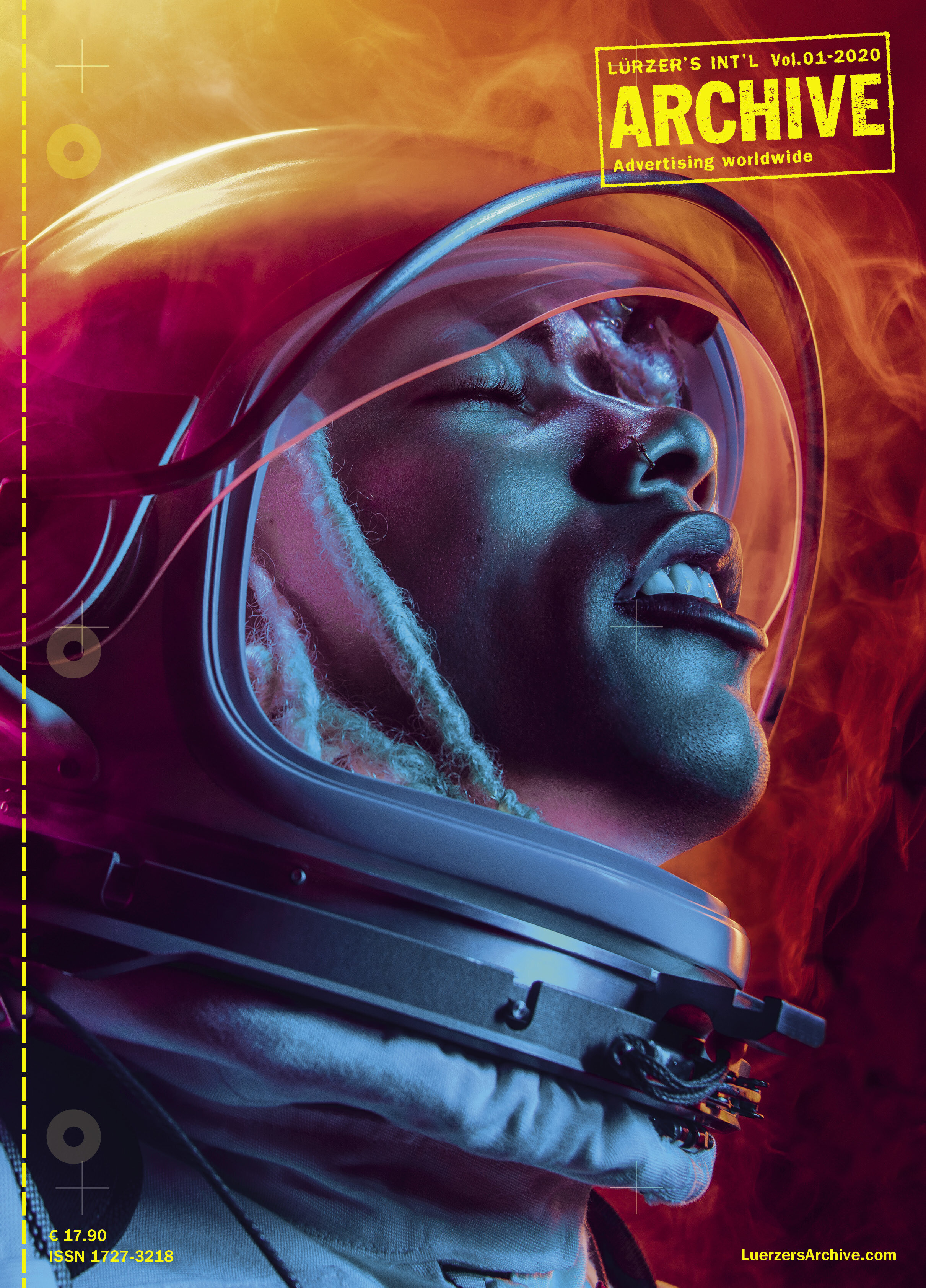
An image of an astronaut hotboxing isn’t something you see every day. Nor is it commonplace to see such a clear depiction of skydiving motion, captured in a still. How about putting the idea of buying a car in a different light? Tim Tadder is a fearless visual communicator, striving to elicit a response from whatever he creates, and Archive Magazine responded. One of Tim’s images is on the cover of Archive’s latest issue – an honor not given to many. How’s that for eliciting a response.
Archive has featured Tim’s imagery 13 times in the last year, giving him the sixth-highest rank among photographers worldwide for his commercial imagery on behalf of brands such as The Astronauts Company, iFLY, and Fair.com, Tim is going nowhere but up. We asked him to share a bit about some of the images highlighted in this issue.

The Astronauts Company
The idea of crossing an astronaut with a pot-smoker is funny and does a great job of taking people higher with your imagery. Tell us about your decision to produce smoke on-set rather than in post? Was there any trial and error while manufacturing the smoke in the subjects’ helmets?
The creatives from Jane and Jay came up with the concept of using the smoke inside the helmet and flowing out as an overall theme, and they came to us looking for solutions. The first question, was it possible without killing someone? If we could fill the helmet with smoke, how could we do it? I always like to have as much in-camera work as possible. I feel you get more of serendipity with what you find, rather than creative directing in post. We had the suit delivered to our studio and started rigging all kinds of tubes and haze machines to find the right density/intensity to get the haze we wanted without compromising the talent inside. We also cast actual cannabis smokers, ones that were all game to do an actual practical hot box, so our subjects had a bit of a tolerance for vaping.

Why do you think Archive chose this image for the cover?
I was quite surprised and taken back that Archive chose this image. I love this magazine and think it features the very best of creative advertising. I was thrilled they saw the brilliance in the creative like I did when I first saw the deck. I am honored and humbled to have the cover and inspired to produce more work that makes people stop and take notice. For me, everything about these images speaks to all the stylistic instincts of my vision; they are filled with color, movement, effect, bold composition, interesting subjects – they have everything I look for in quality content. I guess that is a testament to the creatives at Jane and Jay for letting us run wild with the production and do what we do.
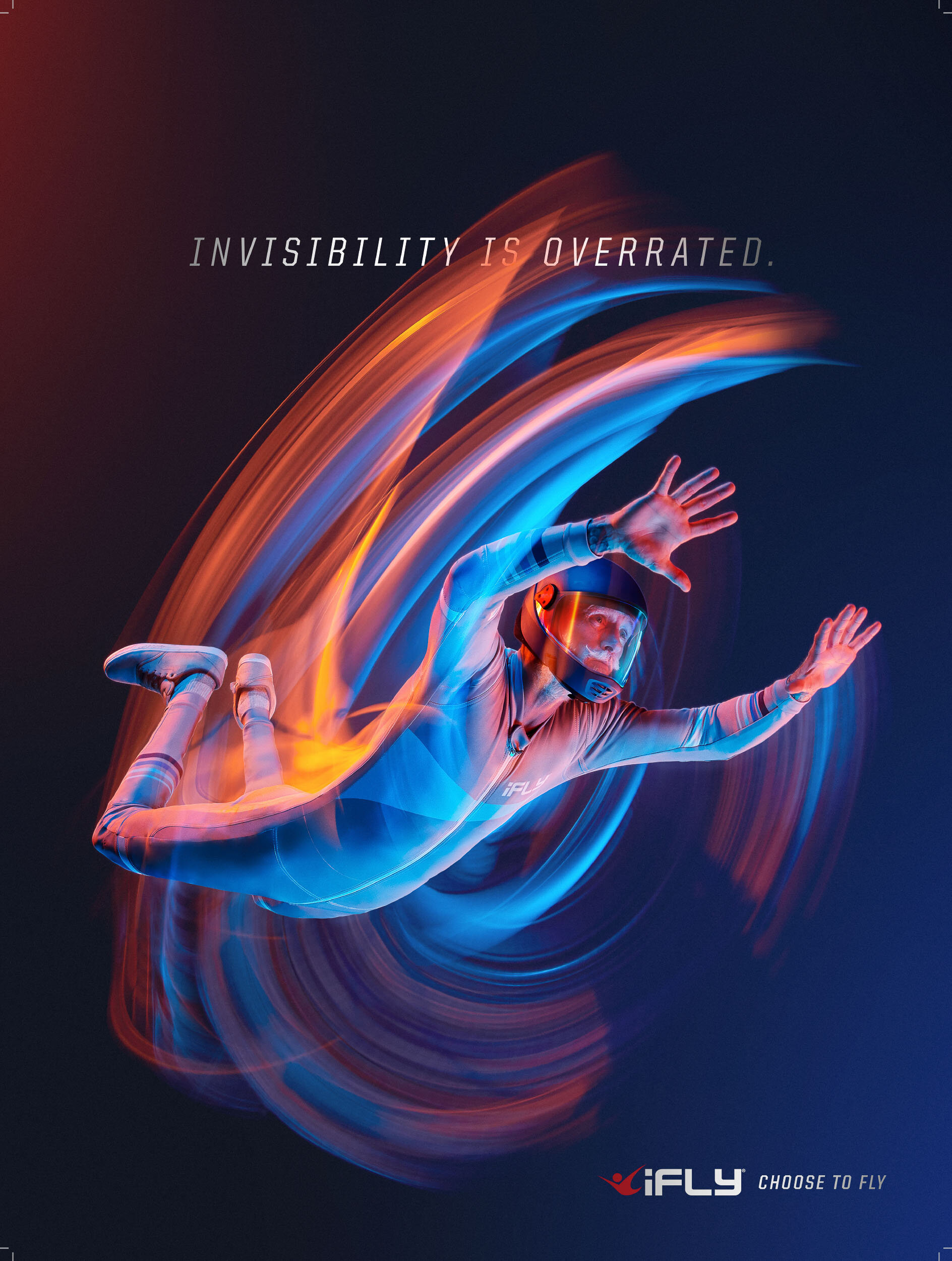
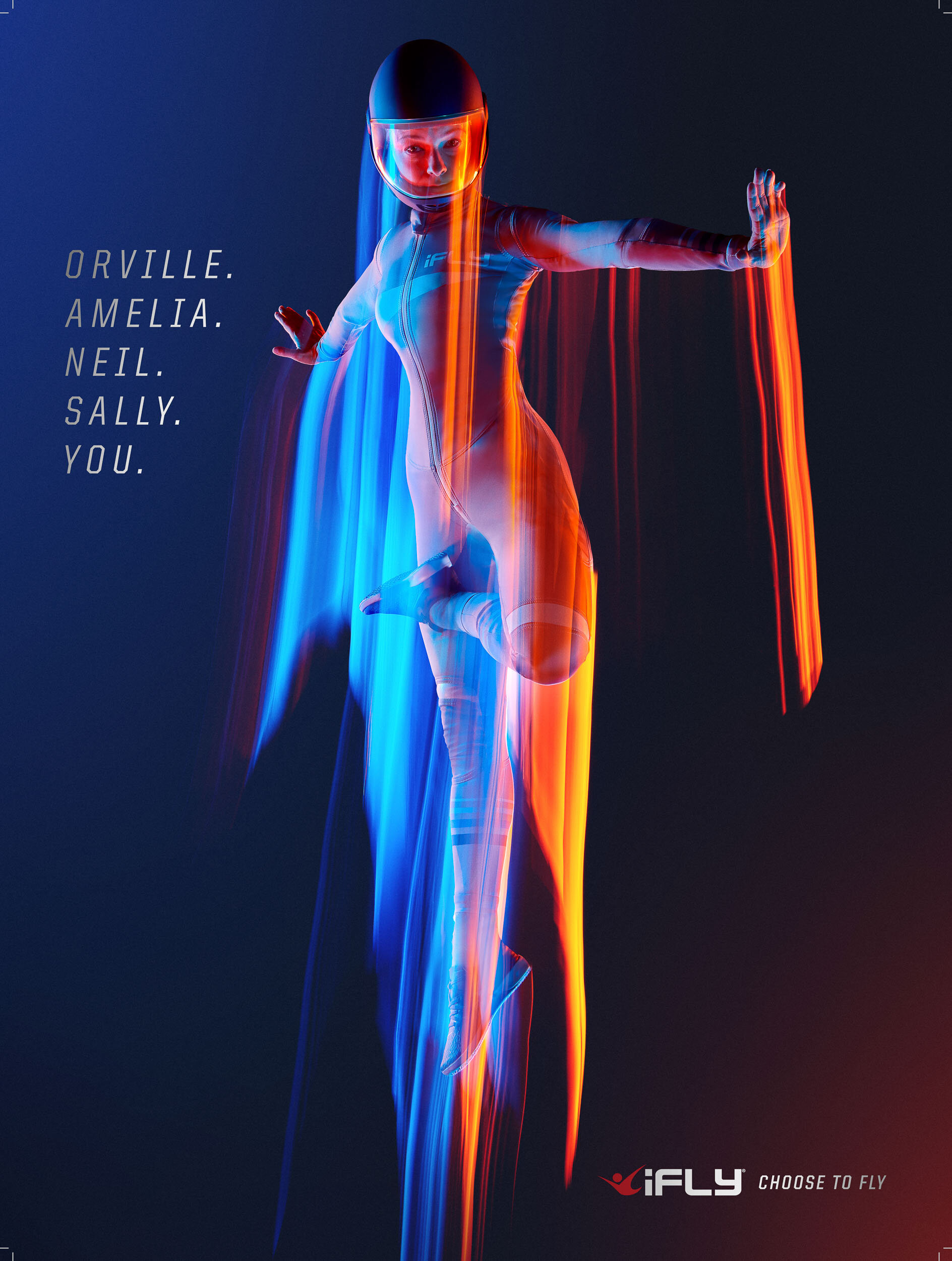
iFLY
We’ve written about your ability to create stills that look like they are in motion in the past. The client spoke extensively about choosing you based on your background of shooting action sports and your ability to depict movement. However, we haven’t talked to you about your collaboration on-set and in-post to make this blur effect so effective. Can you share a bit about the process of bringing this magic to life? Can you tell us why you think Archive chose this image?
These images, captured in-camera, did not have any post work done to the lighting effects. We added a CGI wind tunnel, but the light trails are all in-camera and part of giving motion to a still. It’s a shutter drag technique, and the trails occur from the digital film being exposed for one second as the subjects fly from one side of the frame to the other. When we were shooting, we saw the results. We could then direct the talent as to how we could enhance their movements to be accurate to indoor sky diving, but also exceptionally visually compelling. Talk about serendipity; there were a lot of “awes” on set when the images would pop up on the monitor. People could not believe the results.

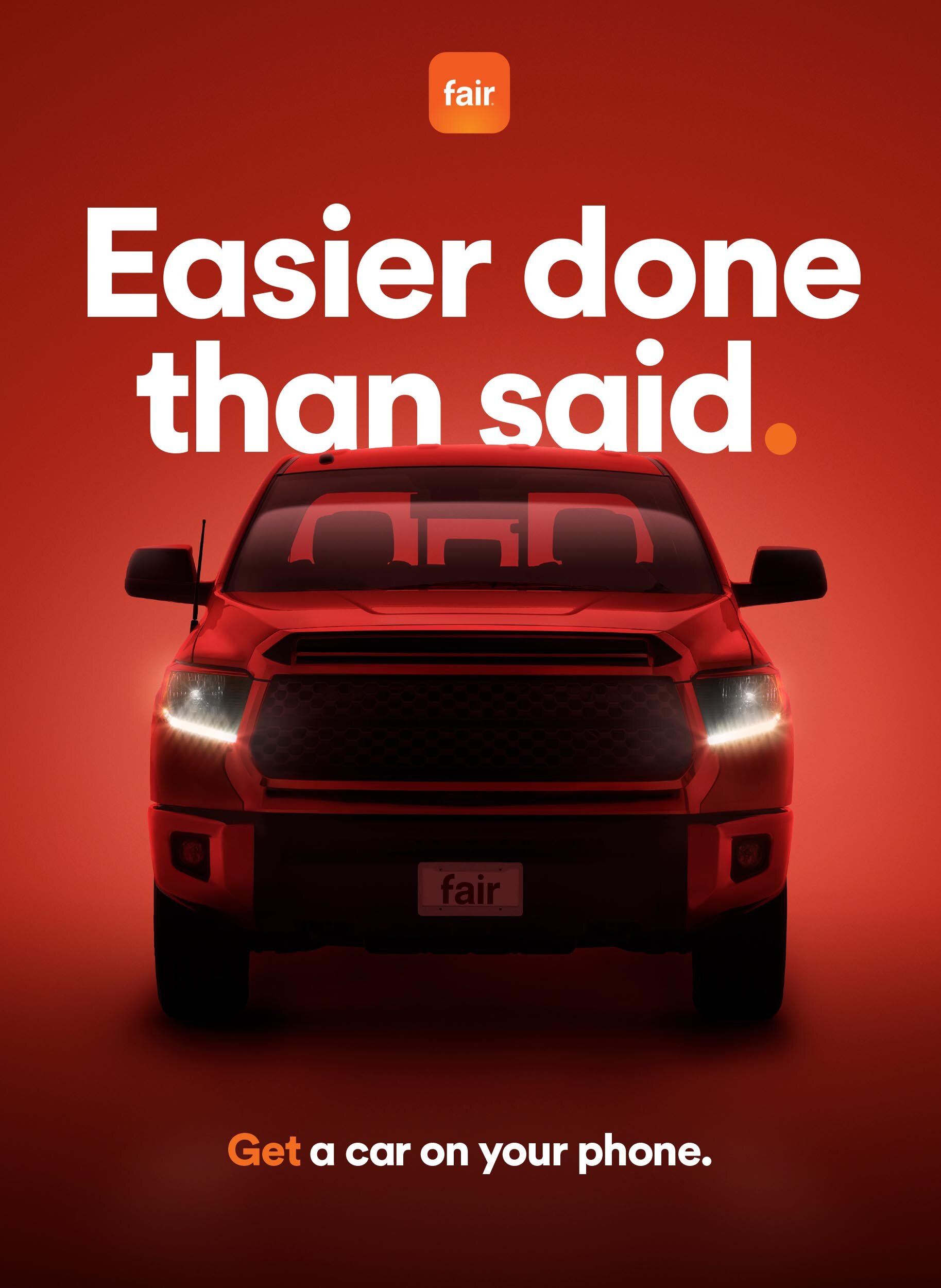
The imagery for this campaign represents the first time you shot automobiles. Your unique approach to color and light is a departure from the usual automotive advertising that we see daily. Was this why they chose you? Can you share a bit about the conversation and thinking in pre-pro that lead you to take this approach?
This was a collaboration with Creative Director, Colin Jahn, who I worked with a few times before at Wonderful Pistachios. Colin was looking at my GLOW series and the way the light wrapped around the subjects and created an ethereal effect. Since FAIR was not selling a particular car, but rather a car buying service for any vehicle, they wanted the automobiles to support the communication and not take over the concept with specifics around the car. With those parameters, we were able to come up with bold compositions and lighting that spoke to automobiles in a sexy “I want” manner without having the audience fall in love with a car brand. The moody colorful images fit right with my style. Being my first commercial car shoot, I feel pretty solid about the results.
You are an inventive photographer who creates epic imagery regularly. What is the bar that you set for yourself and your team? What’s in store for the future? What are some items on your project wish-list?
I think any artist feels that the latest project defines them, so the bar is always set to the highest level with each project. There are many aspects to shoots we can control, so we always take all the variables for failure out of the equation through outstanding production. Once we limit our pain points by forming an excellent team, we are free to execute with confidence to ensure fantastic results. That’s how we win. Anyone that works with my team knows I have very little tolerance for drama and distractions that take away from the goals of an epic result. At this point in my career, I have a team of top-notch professionals that are every bit as passionate at performing as I am. That’s critical to compete in this talent-filled industry – it’s how we inspire. The future holds inspiration and art. I am going to continue to do what I do through innovation, disruption, and inspiration.
Follow Tim on Instagram for more epic imagery that elicits a response.